Post #304 — PayBook
Rate this image
- Brand
- PayBook
- Platform
- Status
- Posted
- Scheduled
- Jul 11, 2026 11:12am PDT
- Posted
- Jul 11, 2026 11:15am PDT
- Created
- Jul 5, 2026 3:50pm PDT
Caption
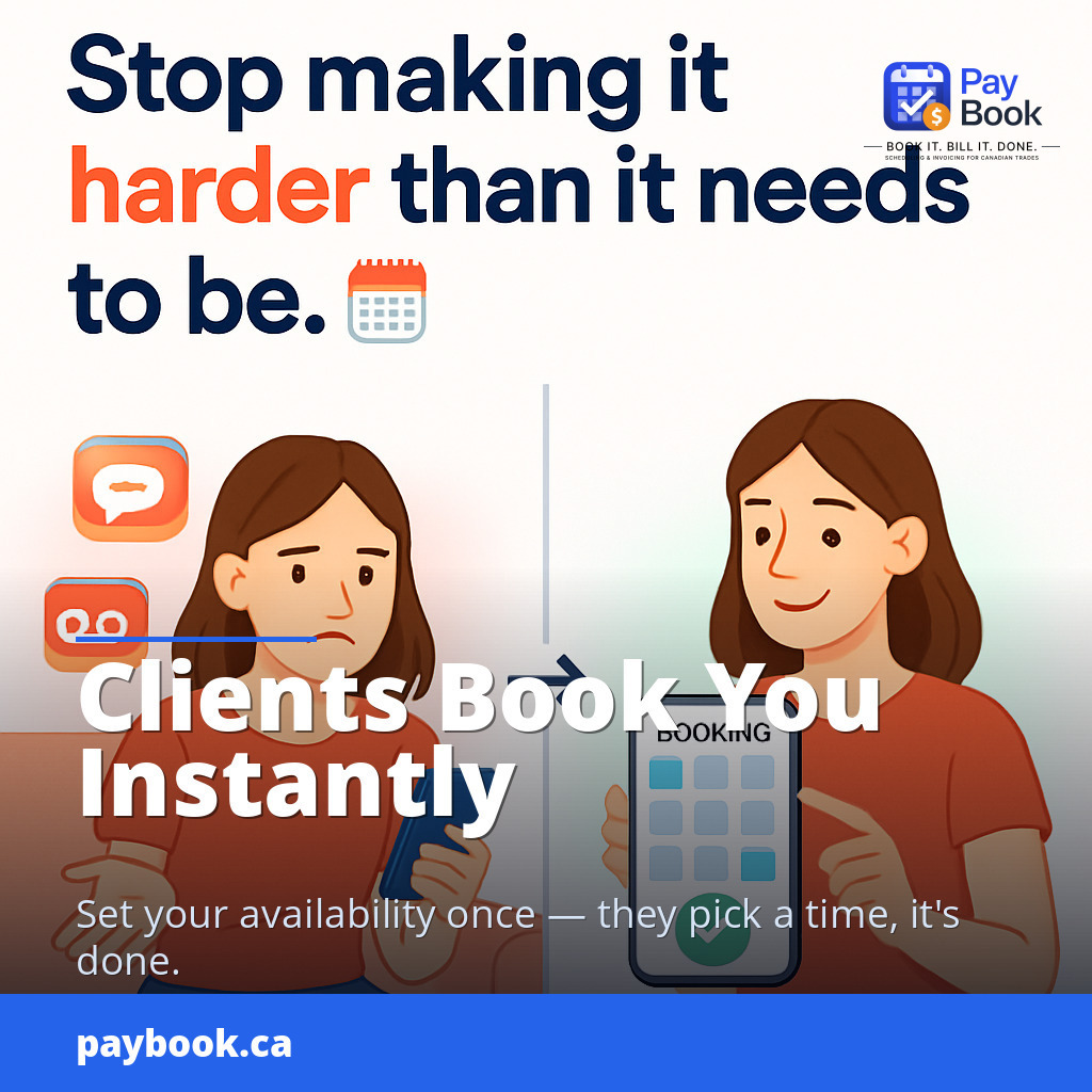
Your clients want to book you — stop making it harder than it needs to be. 📆 Right now, someone is trying to figure out how to get on your schedule. They sent a DM. Left a voicemail. Maybe even texted. And they're still waiting. While you're going back-and-forth trying to find a time that works, they're already checking out the next person on their list. PayBook's free app gives your clients a direct way to book you online — no phone tag, no missed messages, no scheduling chaos. You set your availability once, they pick a time that works, and it's locked in automatically. No missed bookings. No double bookings. No awkward "sorry I forgot to write that down" conversations. It's free to use, takes minutes to set up, and makes you look like you actually have your business together — because you do. Do your clients currently have an easy way to book you online? If not, PayBook.ca is worth 60 seconds of your time 👇
#CanadianFreelancer #SmallBusinessCanada #OnlineBooking #PayBook #FreelancerLife #BookingApp #ClientManagement #SoloBusinessOwner #FreeApp #BusinessTools
Rate this caption
Image Prompt
A split-scene infographic-style digital illustration with a clean white background. On the LEFT side: a frustrated potential client — a casually dressed Canadian woman in her late 20s — sitting on a couch holding her phone, looking confused and slightly annoyed, surrounded by floating comic-style icons showing a DM bubble, a voicemail wave, and a text message notification, all unanswered. A subtle red-tinted overlay or soft red glow signals friction and delay. On the RIGHT side: the same woman, now smiling and relaxed, effortlessly tapping through a clean, modern booking app interface on her phone — a glowing calendar grid with a satisfying green checkmark confirmation appearing on screen. A subtle warm green glow radiates ease and success. The two sides are divided by a clean vertical line or arrow pointing right, suggesting transformation. Floating above in bold navy blue and vivid orange-red modern sans-serif typography: "Stop making it harder than it needs to be." with a small calendar emoji accent. The overall composition is structured, airy, and infographic-style with generous whitespace, flat UI mockup elements, soft drop shadows, and a polished tech-forward feel that is warm, approachable, and Canadian-market friendly.